2D 组态自定义控制弹窗配置指南
本文介绍如何在 2D 组态编辑器中,为画布组件配置「点击触发自定义控制弹窗」的交互行为。通过 openFormPopup 函数,可实现设备点位的实时展示、模式切换、数值输入、指令下发、启停与复位等控制能力,兼容 Modbus 等常见通信协议。
文档分为两部分:
- 第 1~3 章 为配置操作流程,面向配置人员。
- 第 4~8 章 为
openFormPopup参数详解,面向需要编写弹窗 JS 的开发人员。
1 选择触发弹窗的组件
在 2D 组态编辑器图形库中,选择目标交互组件(如基本形状、可切换组件等)并添加到画布中。
随后在右侧 「外观」 属性面板中配置组件基础属性:
| 属性类别 | 具体项 |
|---|---|
| 位置与尺寸 | 位置坐标、宽高、宽高比锁定 |
| 形态 | 圆角、旋转角度、内边距 |
| 线条 | 线条样式 |
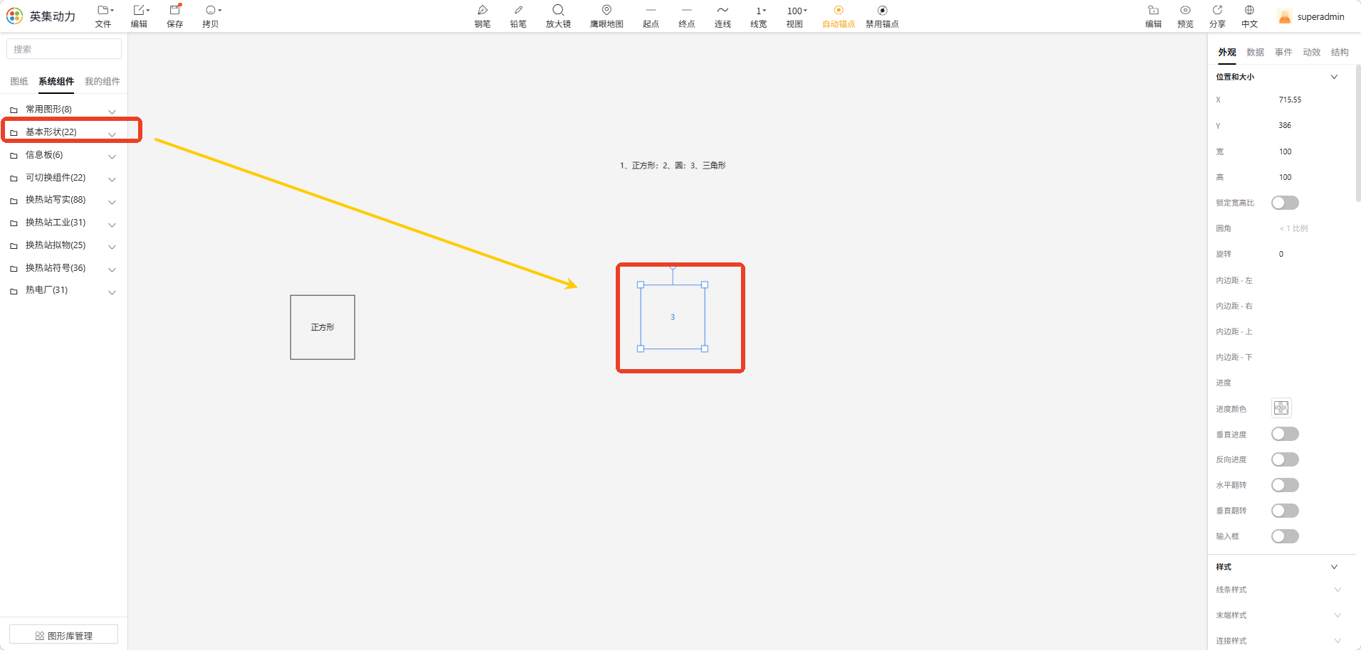 图 1 在画布中添加组件并配置外观属性
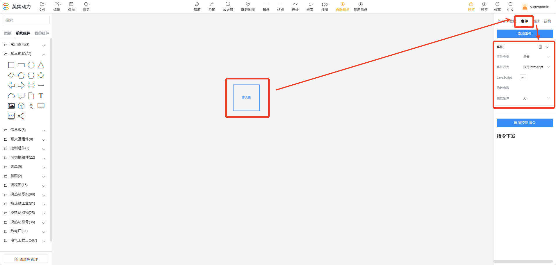
2 配置点击事件与弹窗 JS
选中已绑定点位的组件,切换到右侧 「事件」 配置面板,按以下方式设置:
- 事件类型:选择「点击」;
- 事件行为:选择「执行 JavaScript」;
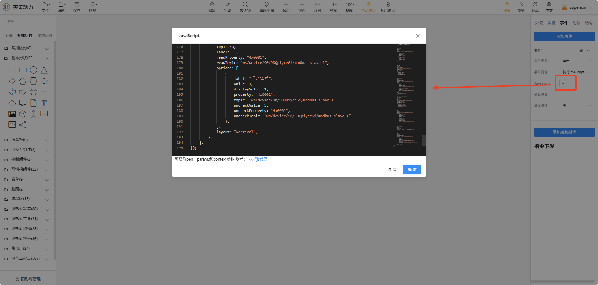
- 在代码编辑区输入弹窗控制代码(完整示例见下)。
弹窗通过 openFormPopup 函数创建,支持自定义尺寸、位置、样式、表单控件及点位绑定信息。
完整示例代码:
openFormPopup({
    // 弹窗基础属性配置
    width: 440,
    height: 340,
    position: "pen",
    penId: pen.id,          // 锚点 ID,执行 JS 时自动获取
    offsetX: 50,
    offsetY: 50,
    title: "1号循环泵控制",

    // 弹窗全局样式配置
    style: {
        fontSize: "18px",
        textColor: "#333",
    },

    // 弹窗表单控件配置
    formData: [
        // 文本展示:显示点位实时值,支持数据转义
        {
            type: "text",
            left: 10,
            top: 10,
            label: "1号循环泵控制策略",
            property: "4x0001",
            topic: "ws/device/90/9DQpiyceGi/modbus-slave-1",
            fixed: 1,
            layout: "horizontal",
            tranList: [
                { transData: "1", transText: "自动调节" },
                { transData: "5", transText: "手动调节" },
            ],
        },

        // 单选框:模式切换,读取点位值并支持指令下发
        {
            type: "radio",
            left: 10,
            top: 44,
            label: "",
            readProperty: "4x0001",
            readTopic: "ws/device/90/9DQpiyceGi/modbus-slave-1",
            options: [
                {
                    label: "手动模式",
                    value: 1,
                    displayValue: 5,
                    property: "4x0005",
                    topic: "ws/device/90/9DQpiyceGi/modbus-slave-1",
                },
                {
                    label: "自动模式",
                    value: 1,
                    displayValue: 1,
                    property: "4x00071",
                    topic: "ws/device/90/9DQpiyceGi/modbus-slave-1",
                },
            ],
            layout: "vertical",
        },

        // 输入框:数值输入与指令下发,同步显示实时值
        {
            type: "input",
            left: 110,
            top: 44,
            label: "",
            property: "4x0001",
            topic: "ws/device/90/9DQpiyceGi/modbus-slave-1",
            placeholder: "请输入",
            layout: "horizontal",
            realtimePosition: "after",
            unit: "L/min",
            style: {
                fontSize: "13px",
                textColor: "#951e1e",
                inputWidth: "80px",
                buttonBgColor: "#1890ff",
                buttonTextColor: "#fff",
            },
        },

        // 开关:双状态切换与点位指令下发
        {
            type: "switch",
            left: 10,
            top: 130,
            label: "",
            readProperty: "4x0001",
            readTopic: "ws/device/90/9DQpiyceGi/modbus-slave-1",
            layout: "horizontal",
            options: [
                {
                    label: "",
                    value: 1,
                    displayValue: 1,
                    property: "4x0005",
                    topic: "ws/device/90/9DQpiyceGi/modbus-slave-1",
                },
                {
                    label: "二次供水流量设置",
                    value: 1,
                    displayValue: 5,
                    property: "4x00071",
                    topic: "ws/device/90/9DQpiyceGi/modbus-slave-1",
                },
            ],
            style: {
                radioCheckedColor: "#1890ff",
                radioUncheckedColor: "#817b7b",
            },
        },

        // 输入框:二次流量设置数值输入与下发
        {
            type: "input",
            left: 220,
            top: 127,
            label: "",
            property: "4x0001",
            topic: "ws/device/90/9DQpiyceGi/modbus-slave-1",
            placeholder: "请输入",
            layout: "horizontal",
            realtimePosition: "after",
            style: {
                fontSize: "13px",
                textColor: "#951e1e",
                inputWidth: "80px",
                buttonBgColor: "#1890ff",
                buttonTextColor: "#fff",
            },
        },

        // 按钮:双按钮实现启停控制
        {
            type: "button",
            left: 10,
            top: 168,
            readProperty: "4x0001",
            readTopic: "ws/device/90/9DQpiyceGi/modbus-slave-1",
            buttonList: [
                {
                    showText: "启动",
                    switchCommand: "1",
                    displayValue: 1,
                    property: "4x0005",
                    topic: "ws/device/90/9DQpiyceGi/modbus-slave-1",
                },
                {
                    showText: "停止",
                    switchCommand: "5",
                    displayValue: 5,
                    property: "4x00071",
                    topic: "ws/device/90/9DQpiyceGi/modbus-slave-1",
                },
            ],
            layout: "horizontal",
        },

        // 单按钮:设备复位
        {
            type: "button",
            left: 200,
            top: 168,
            topic: "device/003/switch",
            property: "on",
            buttonList: [{ showText: "复位", switchCommand: "1" }],
            layout: "horizontal",
        },

        // 单选框:支持取消选中时下发备用值
        {
            type: "radio",
            left: 10,
            top: 250,
            label: "",
            readProperty: "4x0001",
            readTopic: "ws/device/90/9DQpiyceGi/modbus-slave-1",
            options: [
                {
                    label: "手动模式",
                    value: 1,
                    displayValue: 1,
                    property: "4x0001",
                    topic: "ws/device/90/9DQpiyceGi/modbus-slave-1",
                    uncheckValue: 5,
                    uncheckProperty: "4x0001",
                    uncheckTopic: "ws/device/90/9DQpiyceGi/modbus-slave-1",
                },
            ],
            layout: "vertical",
        },
    ],
});
3 验证效果
完成配置后,进入编辑器预览模式,点击已配置的目标组件即可弹出自定义控制弹窗。该弹窗支持以下能力:
- 实时显示点位数据
- 手动 / 自动模式切换
- 数值输入与指令下发
- 设备启停控制
- 复位操作
所有控件均可与绑定点位实时同步,支持双向读写。
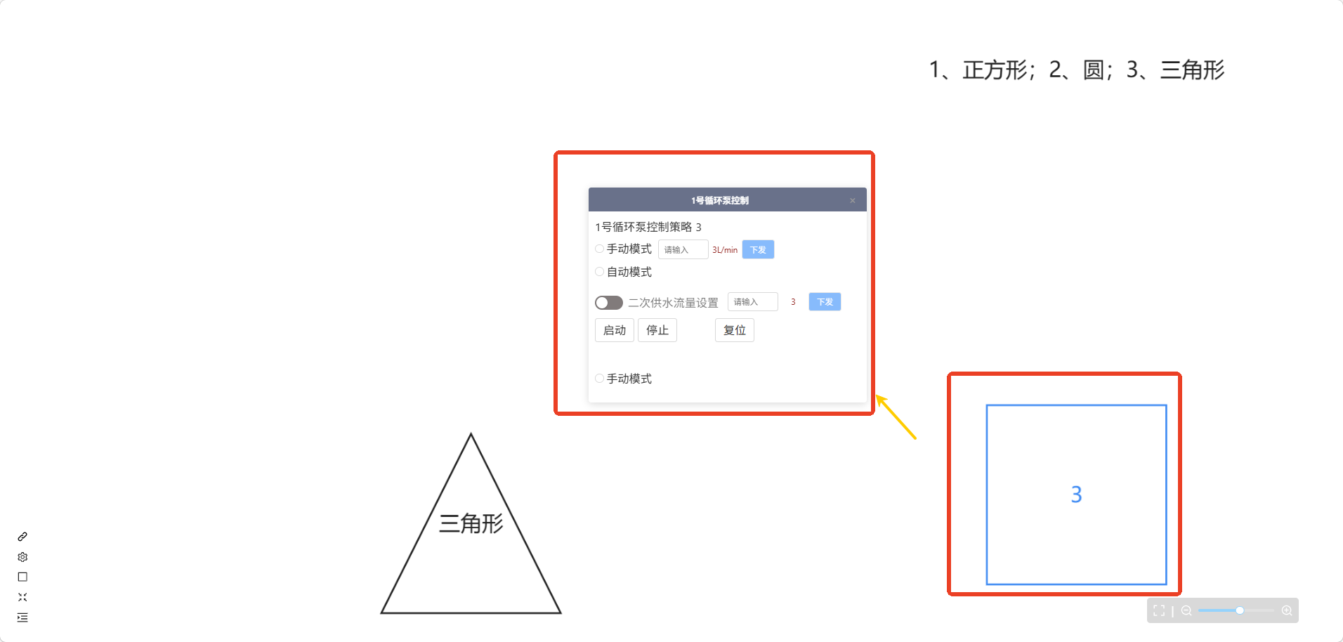 图 3 预览模式下点击组件弹出自定义控制弹窗
4 openFormPopup 参数结构
openFormPopup 接收一个配置对象,由三部分组成:
4.1 弹窗基础属性
用于定义弹窗的尺寸、位置和标题。
| 配置项 | 类型 | 是否必填 | 示例值 | 说明 |
|---|---|---|---|---|
width | number | 是 | 440 | 弹窗宽度,单位 px |
height | number | 是 | 340 | 弹窗高度,单位 px |
position | string | 是 | "pen" | 定位方式,基于锚点组件定位 |
penId | string | 是 | pen.id | 锚点组件 ID,执行 JS 时自动获取 |
offsetX | number | 否 | 50 | X 轴偏移量 |
offsetY | number | 否 | 50 | Y 轴偏移量 |
title | string | 否 | "1号循环泵控制" | 弹窗标题 |
4.2 弹窗全局样式 style
定义弹窗内控件的默认样式。若控件本身配置了 style,则控件样式优先。
| 配置项 | 示例值 | 说明 |
|---|---|---|
fontSize | "18px" | 默认文字大小 |
textColor | "#333" | 默认文字颜色 |
4.3 表单控件数组 formData
formData 为数组,每一项对应一个控件。当前支持 5 类控件:
| 控件类型 | 典型用途 |
|---|---|
text | 只读展示点位实时值,支持数据转义 |
radio | 模式切换,单选 |
input | 数值输入与指令下发 |
switch | 双状态切换 |
button | 一键式操作(启动、停止、复位等) |
各控件的详细参数见 第 5 章。
5 控件参数详解
以下 5 类控件的参数均基于相同的结构说明:核心用途 → 参数表 → 示例代码。
5.1 文本展示 text
只读展示点位实时值,可通过 tranList 将原始数值转义为可读文本。
| 配置项 | 类型 | 是否必填 | 说明 |
|---|---|---|---|
type | string | 是 | 固定为 "text" |
left / top | number | 是 | 控件坐标,单位 px |
label | string | 否 | 标签名称 |
property | string | 是 | 读取点位 ID |
topic | string | 是 | 通信 Topic |
fixed | number | 否 | 数值保留小数位数 |
layout | string | 否 | 布局方式:horizontal / vertical |
tranList | array | 否 | 数据转义规则 |
示例:
{
    type: "text",
    left: 10,
    top: 10,
    label: "1号循环泵控制策略",
    property: "4x0001",
    topic: "ws/device/90/9DQpiyceGi/modbus-slave-1",
    fixed: 1,
    layout: "horizontal",
    tranList: [
        { transData: "1", transText: "自动调节" },
        { transData: "5", transText: "手动调节" },
    ],
}
5.2 单选框 radio
用于模式切换,支持读取当前状态并下发指令。可通过 uncheckValue 系列字段配置取消选中时的备用值。
| 配置项 | 类型 | 是否必填 | 说明 |
|---|---|---|---|
type | string | 是 | 固定为 "radio" |
left / top | number | 是 | 控件坐标 |
label | string | 否 | 控件标签,可为空 |
readProperty | string | 是 | 状态读取点位 ID |
readTopic | string | 是 | 状态读取 Topic |
options | array | 是 | 选项配置,详见下方 |
layout | string | 否 | horizontal / vertical |
options 子项:
| 配置项 | 类型 | 是否必填 | 说明 |
|---|---|---|---|
label | string | 是 | 选项显示文本 |
value | number | 是 | 选项内部标识值 |
displayValue | number | 是 | 匹配 readProperty 的目标值 |
property / topic | string | 是 | 选中时下发的点位与 Topic |
uncheckValue | number | 否 | 取消选中时下发的值 |
uncheckProperty / uncheckTopic | string | 否 | 取消选中时下发的点位与 Topic |
⚠️ 示例代码中多个选项的
value同为1,实际使用时应为每个选项设置不同的value,否则无法区分选项状态。
示例:
{
    type: "radio",
    left: 10,
    top: 44,
    label: "",
    readProperty: "4x0001",
    readTopic: "ws/device/90/9DQpiyceGi/modbus-slave-1",
    options: [
        {
            label: "手动模式",
            value: 1,
            displayValue: 5,
            property: "4x0005",
            topic: "ws/device/90/9DQpiyceGi/modbus-slave-1",
        },
        {
            label: "自动模式",
            value: 2,
            displayValue: 1,
            property: "4x00071",
            topic: "ws/device/90/9DQpiyceGi/modbus-slave-1",
        },
    ],
    layout: "vertical",
}
5.3 输入框 input
用于输入数值并下发到设备,同时显示实时值。
| 配置项 | 类型 | 是否必填 | 说明 |
|---|---|---|---|
type | string | 是 | 固定为 "input" |
left / top | number | 是 | 控件坐标 |
property / topic | string | 是 | 读写绑定的点位与 Topic |
placeholder | string | 否 | 输入框占位提示 |
realtimePosition | string | 否 | 实时值显示位置:before / after |
unit | string | 否 | 数值单位,如 "L/min" |
layout | string | 否 | 布局方式 |
style | object | 否 | 控件独立样式 |
style 可配置项:fontSize、textColor、inputWidth、buttonBgColor、buttonTextColor。
示例:
{
    type: "input",
    left: 110,
    top: 44,
    label: "",
    property: "4x0001",
    topic: "ws/device/90/9DQpiyceGi/modbus-slave-1",
    placeholder: "请输入",
    layout: "horizontal",
    realtimePosition: "after",
    unit: "L/min",
    style: {
        fontSize: "13px",
        textColor: "#951e1e",
        inputWidth: "80px",
        buttonBgColor: "#1890ff",
        buttonTextColor: "#fff",
    },
}
5.4 开关 switch
用于双状态切换,支持状态展示与指令下发。
| 配置项 | 类型 | 是否必填 | 说明 |
|---|---|---|---|
type | string | 是 | 固定为 "switch" |
left / top | number | 是 | 控件坐标 |
readProperty / readTopic | string | 是 | 状态读取点位与 Topic |
options | array | 是 | 双状态配置,结构同 radio.options |
layout | string | 否 | 布局方式 |
style | object | 否 | 控件样式 |
style 可配置项:
| 配置项 | 说明 |
|---|---|
radioCheckedColor | 选中状态颜色 |
radioUncheckedColor | 未选中状态颜色 |
示例:
{
    type: "switch",
    left: 10,
    top: 130,
    label: "",
    readProperty: "4x0001",
    readTopic: "ws/device/90/9DQpiyceGi/modbus-slave-1",
    layout: "horizontal",
    options: [
        {
            label: "",
            value: 1,
            displayValue: 1,
            property: "4x0005",
            topic: "ws/device/90/9DQpiyceGi/modbus-slave-1",
        },
        {
            label: "二次供水流量设置",
            value: 2,
            displayValue: 5,
            property: "4x00071",
            topic: "ws/device/90/9DQpiyceGi/modbus-slave-1",
        },
    ],
    style: {
        radioCheckedColor: "#1890ff",
        radioUncheckedColor: "#817b7b",
    },
}
5.5 按钮 button
用于一键式操作,如启动、停止、复位等。支持单按钮与多按钮两种形态。
| 配置项 | 类型 | 是否必填 | 说明 |
|---|---|---|---|
type | string | 是 | 固定为 "button" |
left / top | number | 是 | 控件坐标 |
buttonList | array | 是 | 按钮列表,每项对应一个按钮 |
readProperty / readTopic | string | 否 | 状态读取点位与 Topic,多按钮状态同步时使用 |
layout | string | 否 | 布局方式 |
buttonList 子项:
| 配置项 | 类型 | 是否必填 | 说明 |
|---|---|---|---|
showText | string | 是 | 按钮显示文本 |
switchCommand | string | 是 | 点击下发的指令值 |
displayValue | number | 否 | 对应读取点位的匹配值 |
property / topic | string | 否 | 下发点位与 Topic(单按钮可省略,使用外层默认) |
多按钮示例(启动/停止):
{
    type: "button",
    left: 10,
    top: 168,
    readProperty: "4x0001",
    readTopic: "ws/device/90/9DQpiyceGi/modbus-slave-1",
    buttonList: [
        {
            showText: "启动",
            switchCommand: "1",
            displayValue: 1,
            property: "4x0005",
            topic: "ws/device/90/9DQpiyceGi/modbus-slave-1",
        },
        {
            showText: "停止",
            switchCommand: "5",
            displayValue: 5,
            property: "4x00071",
            topic: "ws/device/90/9DQpiyceGi/modbus-slave-1",
        },
    ],
    layout: "horizontal",
}单按钮示例(复位):
{
    type: "button",
    left: 200,
    top: 168,
    topic: "device/003/switch",
    property: "on",
    buttonList: [{ showText: "复位", switchCommand: "1" }],
    layout: "horizontal",
}
6 使用注意事项
| 类别 | 要点 | 说明 |
|---|---|---|
| 布局规划 | 避免控件重叠 | 合理设置 left、top,弹窗 width 与 height 应覆盖所有控件范围 |
| 点位一致性 | property 与 topic 须与设备配置一致 | 不一致会导致读取或下发失败 |
| 样式优先级 | 控件 style > 弹窗全局 style | 控件独立配置时覆盖全局设置 |
| 指令值匹配 | switchCommand、displayValue、uncheckValue | 须与设备协议保持一致 |
| 数据转义 | tranList 仅对 text 控件生效 | 建议覆盖设备可能返回的全部状态值 |
| 选项唯一性 | radio / switch 的 options.value 须唯一 | 相同 value 无法区分选项状态 |
7 常见问题排查
| 现象 | 可能原因 | 排查建议 |
|---|---|---|
| 弹窗打开但数据不显示 | property 或 topic 错误 | 核对设备实际点位配置 |
| 指令下发无响应 | switchCommand / displayValue 与设备协议不符 | 检查设备协议约定值 |
| 单选框始终无法切换 | 多个 options 的 value 相同 | 为每个选项设置不同的 value |
| 控件样式未生效 | 控件 style 字段名拼写错误 | 对照参数表核对字段名 |
| 弹窗位置偏离预期 | offsetX / offsetY 过大或锚点缺失 | 检查 penId 是否正确传入 |
8 小结
通过 openFormPopup 配置对象,可在 2D 组态中构建样式、布局与数据交互完全自定义的设备控制弹窗。实际编写时建议重点关注三个方面:
- 控件布局合理:坐标、尺寸不冲突,弹窗容器覆盖所有控件。
- 点位绑定正确:
property与topic与设备实际配置一致。 - 指令值与协议一致:所有下发值与设备协议约定匹配。
以上三点满足后,即可实现稳定、直观的设备控制交互效果。